Data visualization is the illustration of data and statistics via use of graphics, consisting of charts, plots, infographics, or even animations. These visible presentations of facts communicate complicated statistics, data relationships and data-driven insights in a way that is easy to understand.
Prerequisites
A Google Account
Google Sheets
Google Data Studio
Creating a real-time Dashboard for COVID Case Tracking
Create a new Google Spreadsheet over at https://docs.google.com/spreadsheets/
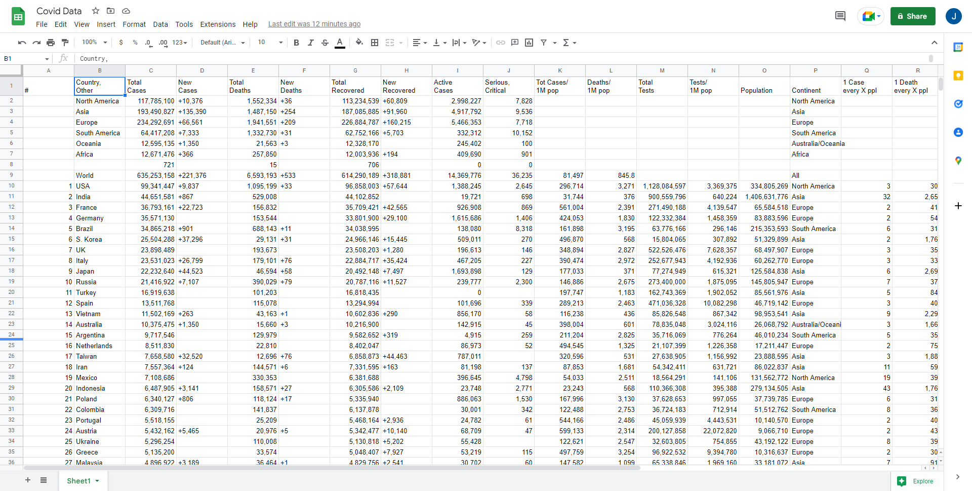
We will be connecting to a data source of free information related to daily covid cases so our dashboard updates daily.
We can get open source data from the following website: https://www.worldometers.info/coronavirus/
In google sheets, use the following formula to pull data from the table on worldometers:
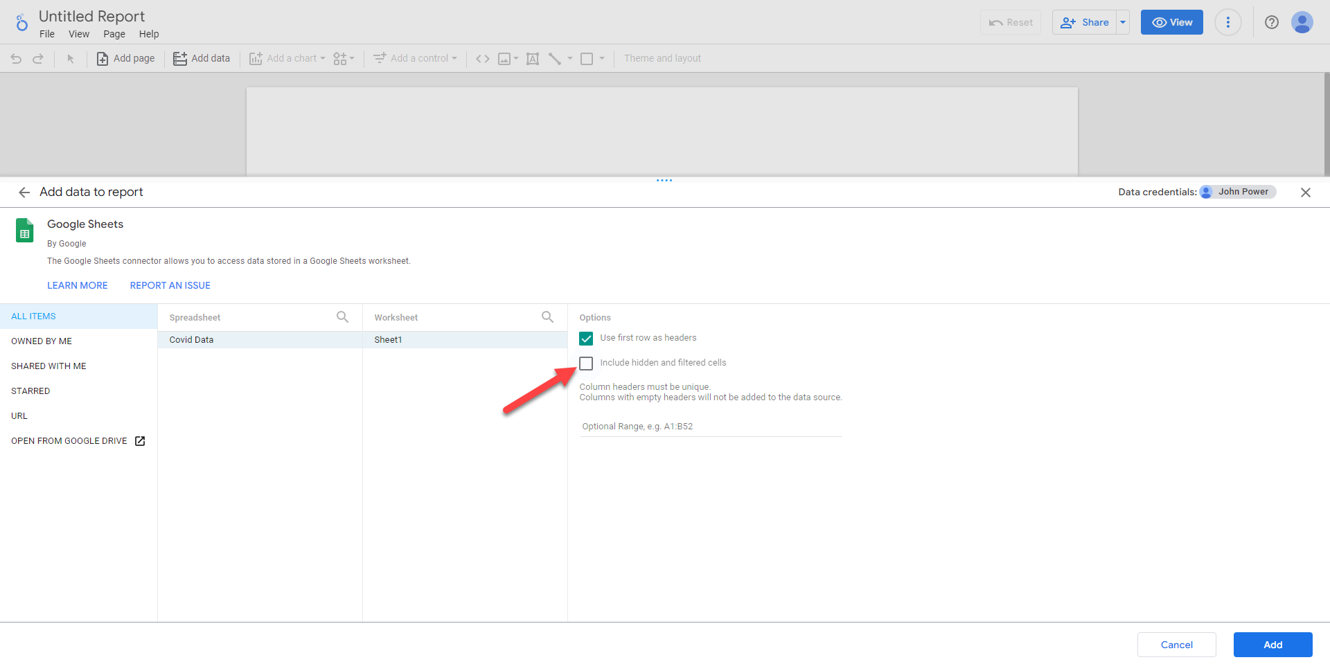
Head over to https://datastudio.google.com/ and create a new report. We can add a huge range of data sources through connectors both in the cloud through API’s and on premises databases through drivers.
For this example we’ll just connect to our Google Sheet hosted in our Google Drive.
Uncheck “Include hidden and filtered cells” as this option will allow us some extra flexibility in manipulating our data then select Add.
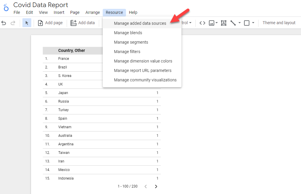
We can manage and manipulate our data source by selecting Resource -> Manage added data sources.
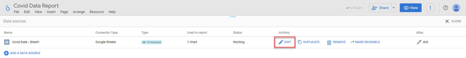
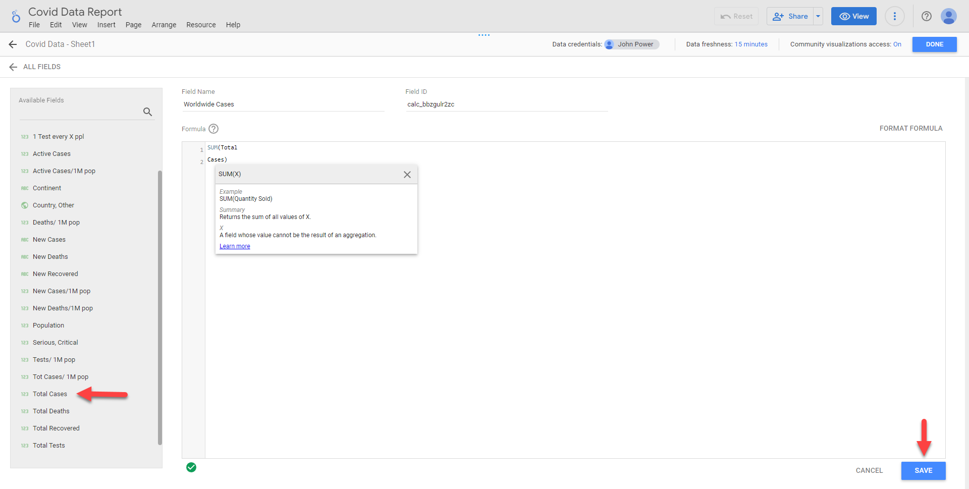
You can validate data types have been imported correctly (integers, strings, booleans, dates, etc.), check field names, hide, delete or add fields here as well. Let’s add one called Worldwide Cases which is a simple Sum function of Total Cases, then hit save.
A quick note is that any manipulation we do to our data (adding fields/columns, calculations, etc.) are all isolated to Google Data Studio, so we don’t have to worry about corrupting the integrity of our source of truth data source.
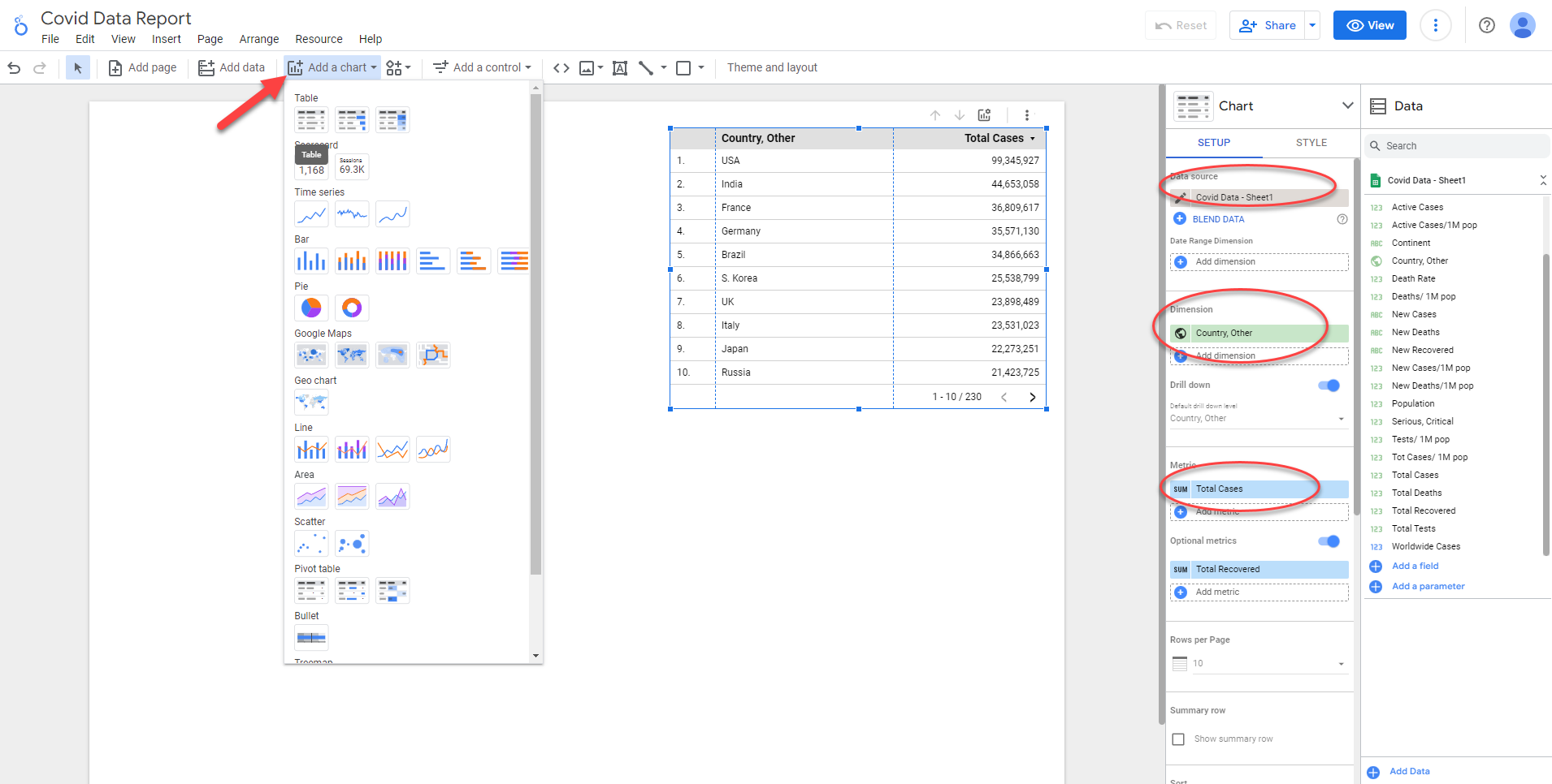
Creating Charts - Table
Data Tab Features:
Data Source – The initial source we setup to pull data from (In this case Google Sheets, hosted on Google Drive)
Dimension – Columns from Dataset
Metrics – Rows of data from Dataset
Optional Metrics – Hidden Column of data, available in View mode
Rows per page – Customisable rows to display
Summary row – Sum of data (eg. Sum of Total Cases)
Sort/Secondary Sort – Allows sorting by Ascending/Descending order
Table Filter – Allows conditional filtering of data we want to see (note: case sensitive conditions)
Interactions – Allows for interactive filters
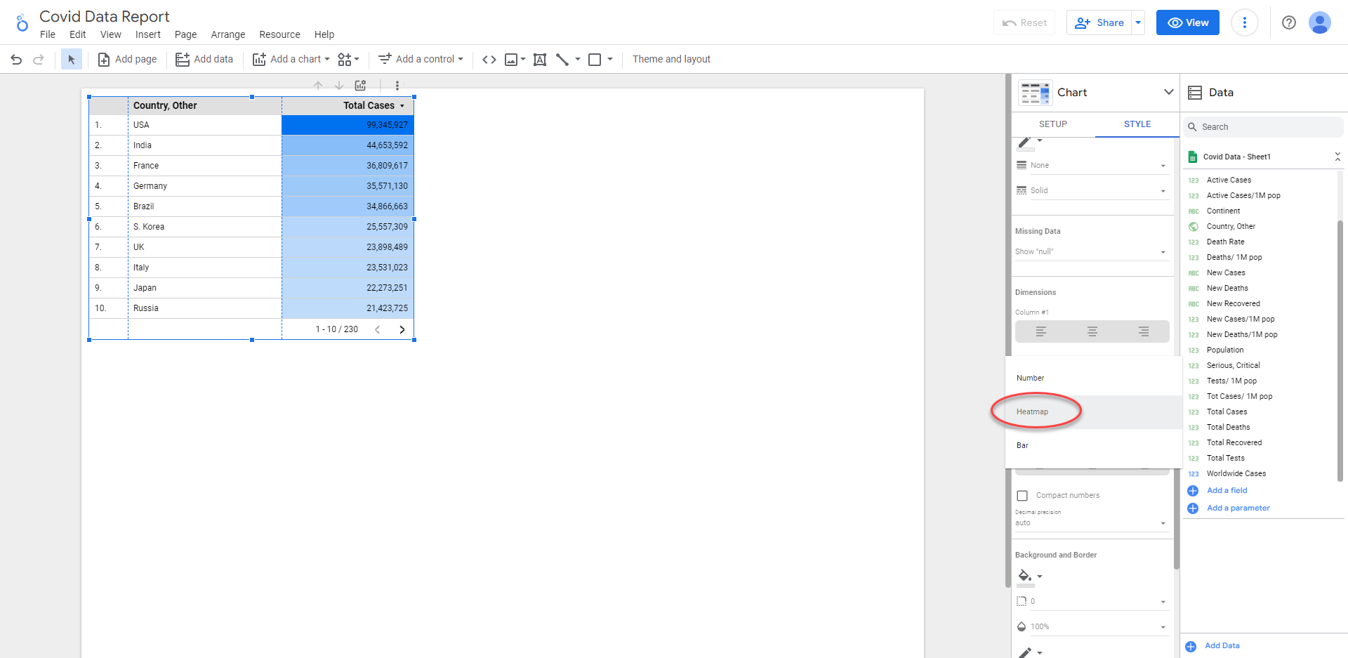
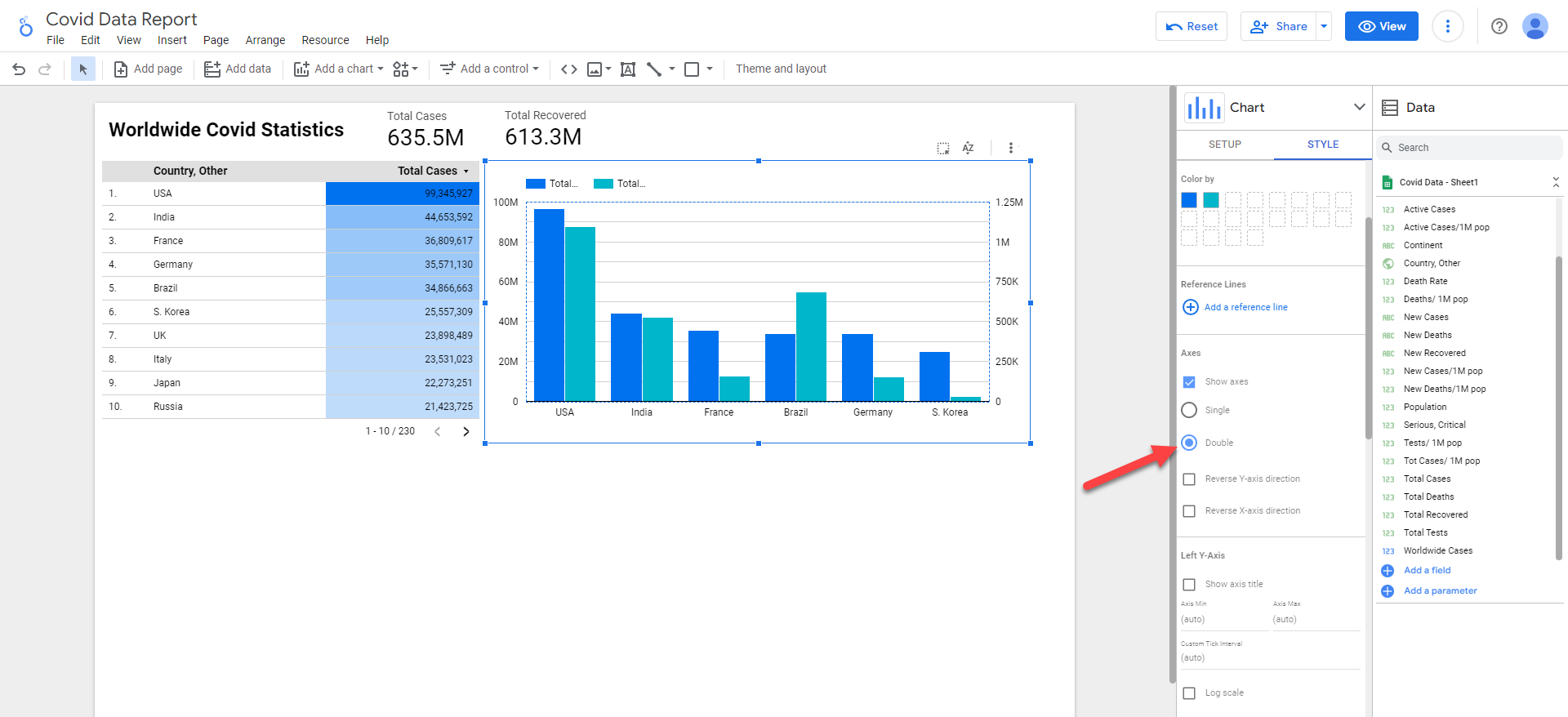
The Styling tab allows us to control the formatting of the look and feel of our Charts, for example we can use a Heatmap to emphasise the total cases by total, or display as a barchart. We can also change fonts, colours, size, etc. to be in line with our company style guide.
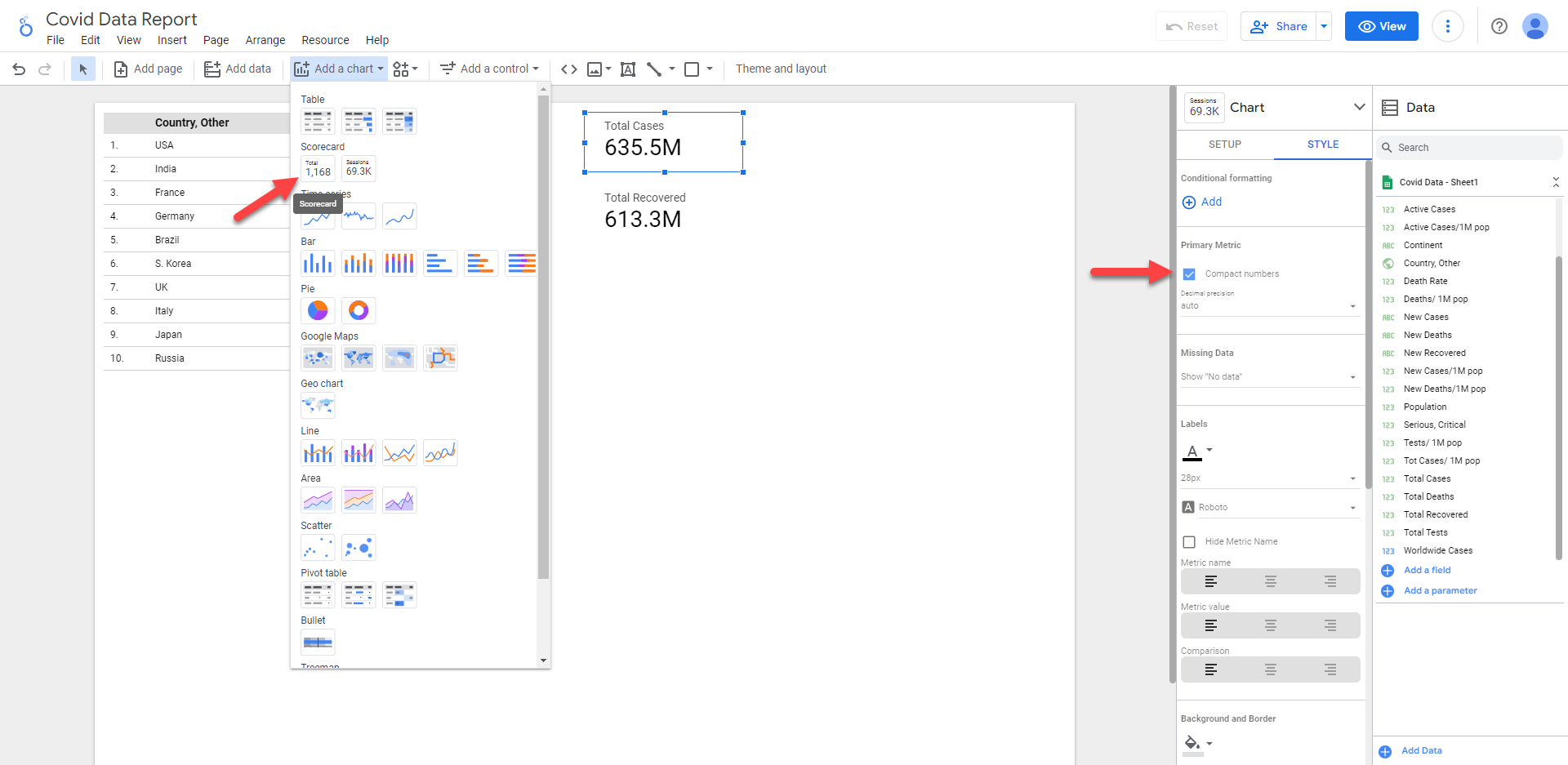
We can also add cards with optional conditions and calculations to display important data at a glance.
For bar charts, we have many options available for formatting such as a horizontal or vertical bar chart, double axes to clearly visualise the difference between metrics as well as calculations such as a log functions to better see metrics that dramatically increase in scale.
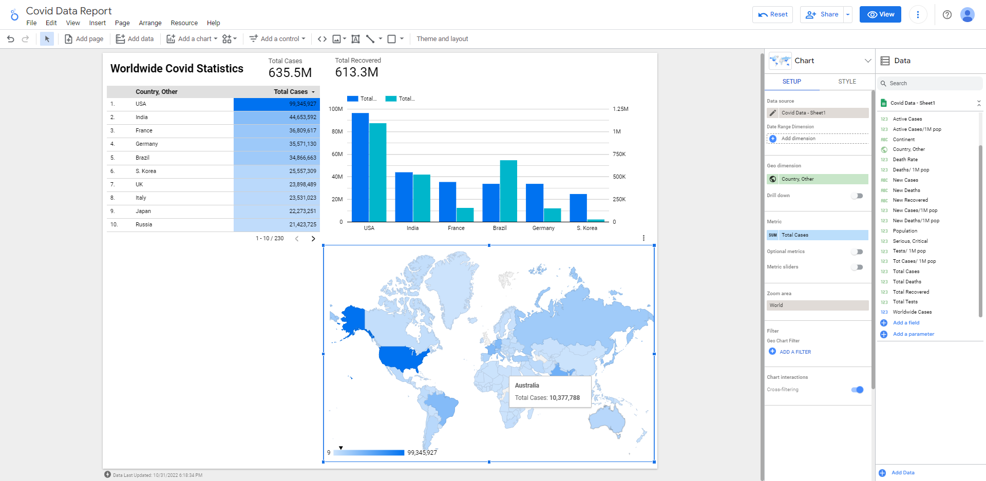
For performing something like geospatial analysis, you can use maps and geo-charts which leads to greater understanding by mapping relevant locations and spotting relationships and patterns.
For example we can get Fuel Price Data across NSW from: