Exploratory Data Analysis in Python, Pandas, Matplotlib and Seaborn
Exploratory Data Analysis
In this project I walk through the process I typically take when exploring a new data set using Python.
Prerequisites
Python & Basic Knowledge of Python Syntax
Jupyter Notebook/Google Collab/Replit/Kaggle etc.
Data Manipulation: Pandas
Data Visualization: Matplotlib, Seaborn
Raw dataset
Problem solving 101
Before performing analysis on any data set, it’s important to understand several key parameters of the problem and end goal in mind:
Understand the problem: Arguing with the data, and asking better questions to get better answers
Objectives: What we intend to do/understand and why?
Strategies/Tactics – What levers can we control from observations and insights of the data to eventuate our intended outcome
We can do this with tools such as a 5C Analysis, Design Thinking, Mapping out SMART goals or any range of problem solving philosophies and methodologies, as if we fail to plan then we plan to fail.
Questioning the Data
What is the overall sales trend?
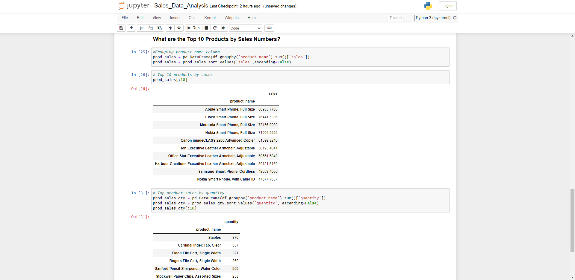
Top 10 products by sales?
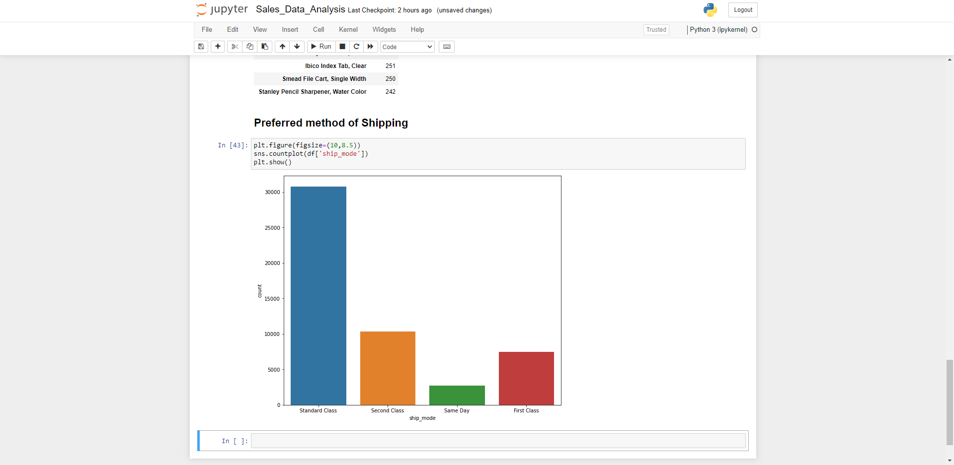
Preferred mode of shipping/Delivery?
What are the most profitable categories and sub-categories?
What is the sentiment of our products by user reviews for continuous improvement?
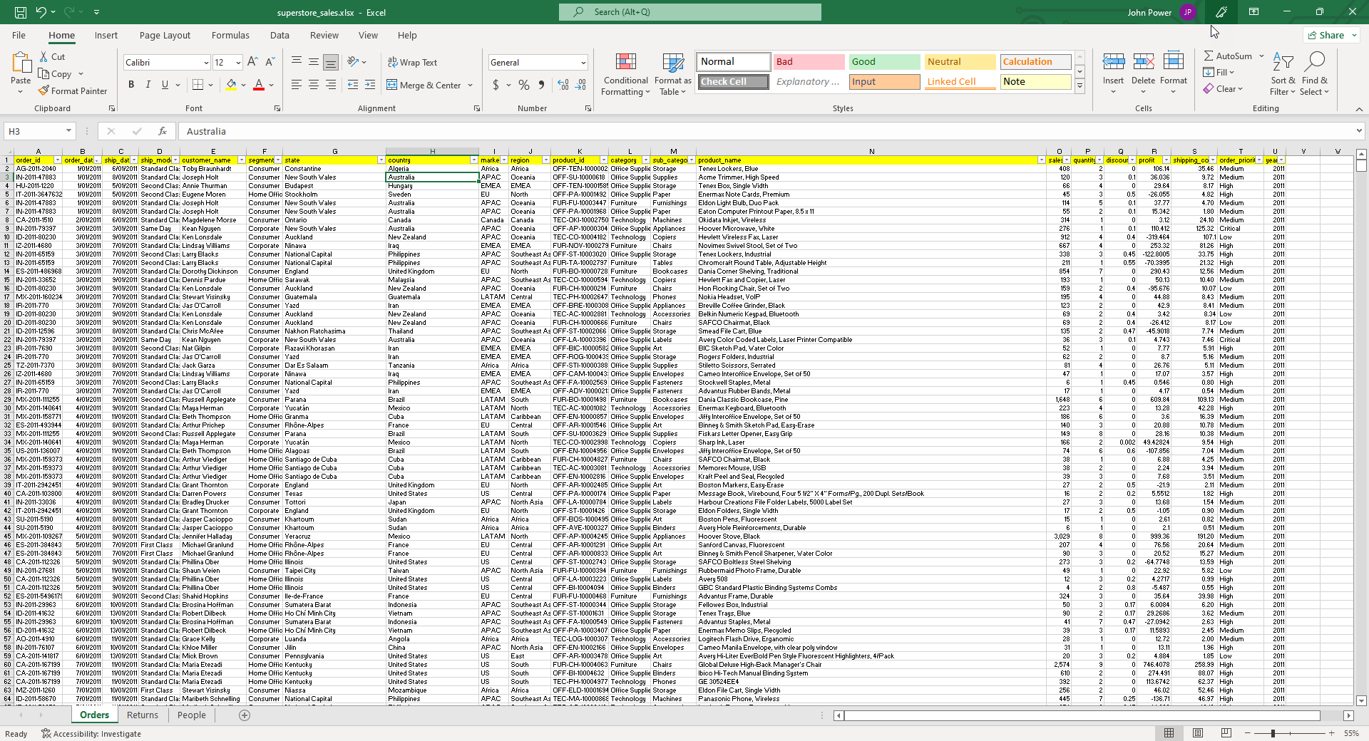
The Data Set
In this project we’re going to use a freely available data set that may look like sales data stored in a typical ERP/CRM System.
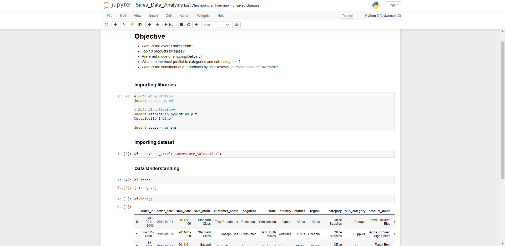
Importing Libraries & Data
In Jupyter Notebook we can import the pandas library for data manipulation, matplotlib and seaborn for visualisation
The first things I try to understand about the raw dataset is the shape of the Dataframe (how many Rows x Columns), head and tail (first and last 5-10 rows of data), dtypes, info and describe functions to get an idea of the data types, information and statistics about the numeric data in our dataset before diving too deep into it.
df.shape
df.head() / df.tail(10)
df.columns
df.dtypes
df.info()
df.describe()
df.isnull().sum() -> checks for missing values in dataset for data cleaning
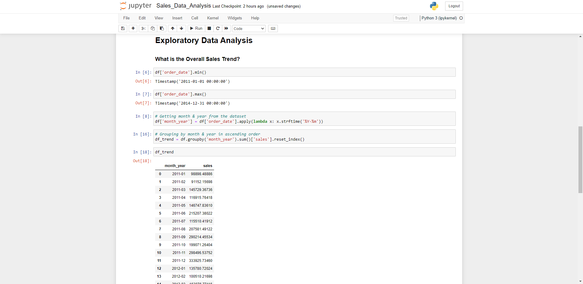
Understanding the Sales Trend
To understand the trend, firstly we’ll take a look at the upper and lower bound constraints for the dates of the dataset, then group by month & year in ascending order as this is quite a large dataset. This can be achieved by storing a the data in a variable and applying a lambda function, which is a small and restricted anonymous python function. We call the strftime method to represent the data and time returning a string value.
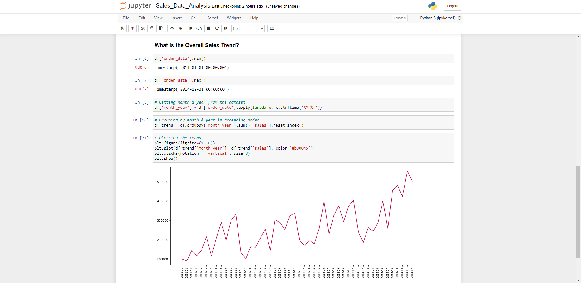
We can use matplotlib to plot out a very basic visualization of the data to get a better picture and some insights of how the company is trending over time. Some immediate observations are during the first quarter of each year the sales are quite low, then pickup throughout the year which could be due to the Christmas/New Years shutdown period. Efforts in marketing, resourcing and promotional offerings could be used to gain some momentum earlier in the year.
Wrapping up
Using Python & Pandas allows us to quickly and easily manipulate data sets, ask questions to the data and find real value add insights buried within thousands of rows of information. Graphically representing our information provide us an accessible way to find trends, outliers and patterns in our data.
As humans, our eyes are drawn to identify colours and patterns whereas AI and Machine Learning can much more easily interpret large raw datasets. When we see our data in a visual form, we can understand it quickly – story telling, with a purpose. From there we can extract reports, observations and actionable insights to leverage our data to make better, informed decisions.